I don't talk about this much but I used to be art director of several children's magazines. One of my responsibilities was to review portfolios from illustrators who wanted to do work for us. It's not an exaggeration to say that I've seen hundreds (seems more like thousands) of portfolios. So I know a little about this subject :)
"An effective portfolio accurately represents the designer's abilities and skills in the best possible light. This means that it is clean and well put-together, and while it's nice to try to be a little different, a portfolio should not look gimmicky. The viewer should be more aware of the work than the portfolio itself. An effective portfolio illustrates the designer's self-presentation and communication abilities as well as showcasing the work."
Some basic portfolio "rules"—
• Since you should only show 10-15 samples make sure it's your very best work. Start off with your strongest piece, end with an equally strong one, and have a good solid middle.
• Keep your samples fresh. Anything older than 3 years should be taken out. People want to see what you're doing now, not what you did several years ago.
• Tailor your portfolio to the specific interview and show work that's relevant to that business.
• Have a sample that you can leave with the person you're showing the portfolio to. And make sure your contact info is on it.
I work in two fields so I have two portfolios. But even these are fluid as I add or subtract samples based on the needs of the clients I'm showing them to. My graphic design portfolio has a lot of publication design work but, if I'm meeting with a corporate client, I add more business-oriented samples.
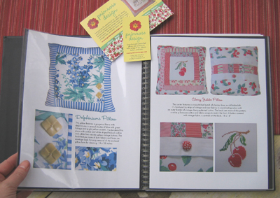
For Primrose I have a book of designs that serves as a carry-along portfolio. It's hard to carry more than one actual pillow when I meet with shop owners about carrying my things in their stores. So, the portfolio serves as a showcase of past designs and hopefully covers the kinds of things they sell. While I like making the funky and colorful pillows best, some shops are more sweet and girly. I try to do some research ahead of time and tailor my samples to what I think will work best in their shop. Here's what the book looks like.

I print up the 8.5 x 11 individual sheets on photo paper and slip them into the plastic sleeves. It takes just minutes to replace old designs with new ones and I can tailor the pages specifically to a particular shop. For a leave-behind, I have business cards and my latest postcard with my contact information on it.
Shop owners (and art directors) are busy people so make the process as easy as possible for them. Anticipate their needs and make sure your portfolio reflects those needs. Pretty simple really :)
See more portfolios here.


12 comments:
Your portfolio is well organized and lovely. I also have one but mine is for writing (I'm a proposal manager/senior technical writer). Some of my work is old because most of what I do is confidential and proprietary to particular companies. This makes it hard to show a potential employer writing samples. I revisited this subject just yesterday when I had to submit samples--how very timely your posting is for me.
My husband is a technical writer, too, so I know exactly what you're talking about. So much of his work is computer software related and for the company he's writing for not the public.
Great post and really good info. My daughter is in the process of putting together her portfolio for 'the real world'. She created an amazing teaser portfolio to send to firms (interior design and architecture)...a proud momma!
Great idea, and lovely too. I really need to get back into Studio Friday! I miss it!
As someone who has never done a portfolio, I really appreciate your organized approach -- to your portfolio and also to describing it for us!
I like your plan very much.
Thanks for sharing it with us!
It's really good to see how you have created two portfolios for two sides of what you do. I've started to put together a book, similar to yours, for my Made by Milla stuff- at the moment a lot of it is just me keeping clippings together and photos that have been taken at fairs etc. I really do need to get this organised into something more coherent, get images of products together etc etc- but this all means that i'll have to start taking that side of things a bit more seriously and i'm not 100% sure i'm ready for it yet. I guess there's no harm in practising all these things is there!
Thank you for the great info....Your portfolio looks so good.
Thank you for such a great post full of advice and expertise!!
I love Studio Friday because we get to 'meet' and introduce ourselves into such a fantastic forum of artists!!
I hope you hvae a lovely weekend!
~Gabi
that's excellent information and advice. thanks, Janet!
Thank you for a great post with useable information and tips.
Terrific advice, and lovely examples---very inspirational---thank you!
What a marvelous read! Thank you f or all the good tidbits of info Janet!
and your portfolio is wonderfully practical and gourgeous!
:) Abbie
Post a Comment