
The list of colors I don't like together is much smaller than the one that I do. I think there's a place for most color combinations, even ones we don't use very often. Some people, for example, don't like to put bright hot colors together because they seem to vibrate. Personally I don't mind that.
I think the colors I don't like are the dull, muddy ones. A new quilt shop opened near where I live recently and I was so disappointed to learn that they are focusing on the "country" color palette—the deep dull reds, wedgewood blues, dark greens, mustard yellows, and browns and beiges that are used in this genre of quilting. I have no problem at all with the incredible quilting skills involved in the making of these quilts (in case anyone is offended by my opinion)—I just hate the colors that are so often used.
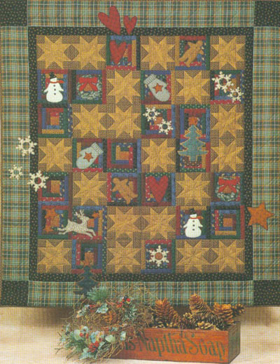
Here's an example that uses the Thimbleberries line of fabrics—
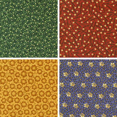
And some of the fabrics themselves.
I don't even have a problem with the prints, but the combinations just don't do much for me. Check out what others have to say on this topic here.


9 comments:
I agree with the 'country' color scheme, give me vibrations any day!
I also agree, I do some quilting and dont enjoy those muddy colors either, I like vibrant pinks and purples, it makes everything feel alive.
lee
I blogged about color earlier this week and compared two quilts of exactly the same pattern in two color ways. I completely understand what you are saying. I happen to be attracted to these colors alot. But I also find myself studying the brights and pastels at times. I don't do commissioned work though - because I find I can't work with color combinations I just hate.
I wonder if what you really dislike about these so-called "country colors" is their ersatz-ness. The pretend fadedness, the fake vegetable dyed quality, the coy groupings of colors that "tone". Having hung around in the country and seen a lot of wash lines hung with clothes and quilts I have to say that these "country colors" don't exist in the real country!
And a real, used, faded piece of cloth has an intense subtle beauty that cannot be faked successfully.
I don't mind the muddy colors, but not used in an extreme *country* motif.
I couldn't put my finger on it until I read n.b.'s comment on the "pretended fadeness" and such. That's exactly it for me.
How on earth can they call those colors "country"???
I live in the country, and the colors of nature out here are vibrant and alive. More likely one would find colors like this in the city's dark alleys or basements!
;-}
The fakeness that you mention n.b. (and others) has a lot to do with my dislike. It's like someone decided that this would be the "country" palette, it was marketed as such and everyone seemed to pick it up and follow along without questioning.
When I think of country I think of my grandmothers house—white clapboard with the porch painted that pretty clear green that was so popular in the 40s. I picture her faded floral barkcloth porch cushions and the colors of the flowers in her garden. The washed clothes drying on the line. The blue of the sky on a clear day. The corn growing at the farm next door and white chickens with red combs. To me, those are the real country colors.
mmm, I hate those colors, too! They feel depressing and dirty to me. Like they need a good washing so they can brighten up a bit.
Post a Comment